Styling Widgets in Tk (tkinter)
You already have a desktop application written in Python with Tk, and now you want to make some changes to the appearance of the UI (buttons, labels, text boxes, etc.) By default, widgets in a tkinter application have a certain appearance, which in most cases is quite acceptable as it conforms to operating system standards. However, you have the possibility of altering the default appearance of any widget (e.g., changing the text color of a button from black to red). This can be done in two different ways.
The reason why there are two different methods to modify the style of the UI is that there are two types of widgets in Tcl/Tk. Let's call them classic widgets and themed widgets. Classic widgets are the original Tk widgets, which you can access via the tkinter module (usually abbreviated tk). Themed widgets were introduced in Tk 8.5 and are contained in the ttk Python submodule. The difference between the two types of widgets is mainly cosmetic: themed widgets have a more modern appearance and support a better customization system for their appearance (which we will explain in this article) than the traditional system.
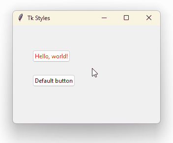
For example, take a look at the difference between a button created from the tk.Button class (left) and one from ttk.Button (right):
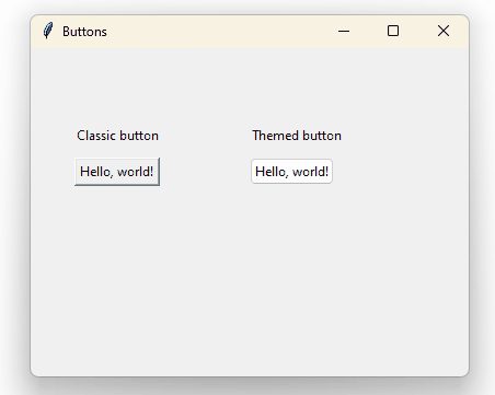
(The appearance of the buttons changes, of course, from one operating system to another.)
When creating a button you can choose any of the two classes, but, in addition, the ttk module (from themed tk) features new widgets that have no correlatives in the classic widgets, and vice versa. Here is the complete list of widgets:
Classic widget |
Themed widget |
|---|---|
|
|
|
|
|
|
|
|
|
|
|
|
|
|
|
|
|
|
|
|
|
|
|
|
|
|
|
|
|
|
|
|
|
|
|
|
|
|
|
|
|
|
|
|
|
|
|
|
|
When a widget is available in both its classic and themed versions, you should prefer the themed one. We already mentioned the reasons: they look nice by default and have better styling system.
Now let's see how to change the appearance of both types of widgets, starting with themed widgets.
Themed Widgets
The central concept in understanding how to change the appearance of theme widgets is style. A style is a class that contains information about the appearance of a type of a widget. In order for a particular widget to receive the appearance of a style, you must indicate the name of the style when creating the widget. By default, all themed widgets have an assigned style.
For example, let's create a window with a themed button:
The button appearance is given by the style that Tk applies to every button by default, which is why the button looks like this:
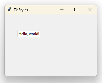
Gray background, black text color, dark gray outline, two or three pixels spacing, etc., are all properties of the default style applied to this button. The name of the style (all styles must have a name) applied to buttons by default is TButton. Default style names usually consist of a "T" followed by the name of the widget, although there are exceptions. Here's the full list:
Themed widget |
Default style |
|---|---|
|
|
|
|
|
|
|
|
|
|
|
|
|
|
|
|
|
|
|
|
|
|
|
|
|
|
|
|
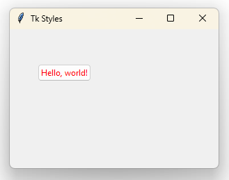
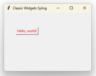
Properties of each style can be changed using Python code. So, for example, if you modify the TButton style so that the text color is red, all buttons created from the ttk.Button class will have red text.
|
s = ttk.Style()
|
|
s.configure("TButton", foreground="#ff0000")
|
|
button = ttk.Button(text="Hello, world!")
|
|
button.place(x=40, y=50)
|
We are first creating an instance of ttk.Style, through which we can configure existing styles (as in this case, TButton) or create our own styles. By using the configure() method we customize the properties of the styles by giving their names as arguments. So, we pass the foreground (text color) argument with the value "#ff0000", which is the hexadecimal code for the red color. (You can get hex codes for any color from this site.) The result is as follows:
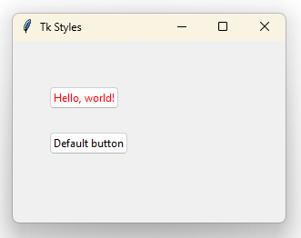
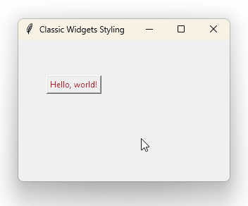
However, it would be rare to make changes directly to default styles (TButton, TLabel, TEntry, etc.) so that all instances created from the corresponding classes (ttk.Button, ttk.Label, ttk.Entry) inherit their appearance. You would probably want to modify the appearance of specific widgets. For this, you must first create a new style and then specify it on the creation of a particular widget. For example, if you want only one button to have red text:
Notice that we are creating a new style named Danger.TButton. Style names are important: they cannot contain spaces and they follow Python's classes naming convention (first letter of each word is capitalized). We are choosing the name Danger for the new style, but adding the .TButton suffix to indicate that this style applies to buttons (ttk.Button). This way, buttons with the Danger.TButton style applied to them will have the base appearance of the TButton style, but will add (or override) the properties of the new style. For instance, the Danger.TButton style does not define any background color, so the one defined by default in TButton will be applied.
To apply a new style to a particular instance of a widget, pass the name of the style via the style argument (line 9 of the above code.) Notice that the second button, for which we have not specified the style, keeps its default text color:
The names of the properties that can be customized (that is, the arguments that can be passed to the configure() method) change depending on the type of widget. foreground, as we saw, controls the color of the text; background controls the color of the background; whether it is a button, or any other widget that has text or background. Other common options among widgets are anchor, bordercolor, font, padding, justify. Check the documentation of each widget to learn the specific options.
In addition to configure(), there is a map() method, which allows you to customize the appearance of a widget in its various states. Widgets in Tk can be in multiple states: for example, a button can be disabled, it can have the mouse over it, it can be pressed, or it can be in a normal state (none of the above). Each of these states has a name: disabled, active, pressed, normal, respectively. The appearance of a widget in its normal or neutral state is specified via configure(), as we just did with the color of the button, while modifying the appearance of a widget in a particular state requires the use of map(). So, for example, using the following code you make the buttons that have the Danger.TButton style show the text in orange when the mouse is over them.
This method, like configure(), takes a style name as first argument, and the remaining keyword arguments indicate the properties, but each property must be a list of tuples in which the first element is the name of a state ("active") and the second is the value that this property should have in that state (in this case, a color, "#FFA500".)
These are the fundamentals of Tk's styling system. Now let's see how to modify the appearance of classic widgets.
Classic Widgets
Modifying the appearance of a classic widget is considerably easier than using the styling system we've just seen, but it's a messier method and doesn't encourage code reusability. You just need to pass the properties that customize the appearance of a widget on instantiation.
The shortcoming of this method is obvious: style settings are scattered throughout the code, while the themed widgets' styling system allows you to isolate the customization of an entire set of widgets in a single style. This is exactly why we no longer use HTML attributes for styling web applications and rely on CSS instead.
The names of the properties that control the appearance of classic widgets are, in most cases, the same that those of themed widgets (foreground, background, font, etc.) However, properties related to particular states have their own name. For example, if you want to change a button's text color when it is active, you must use the activeforeground argument:
Note that the active state has a different meaning: it means, rather, when the button is being pressed.
When you need to apply the same appearance to multiple classic widgets, since you can't use styles (ttk.Styles only applies to themed widgets), you would better create a class. For example, you could emulate the Danger.TButton style from the previous section with a new DangerButton class:
Customizing classic widgets does not have much more complexity. Whenever possible it is better to stick to themed widgets with their respective styles.