Textbox (Entry) in Tk (tkinter)
A textbox lets the user enter any one-line text. In Tk it is represented by the ttk.Entry class, which inherits the features of a more primitive widget called tk.Entry.
To create a textbox let's first create an instance of the ttk.Entry class.
This code creates the following interface:
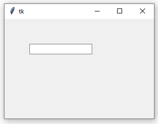
To specify the text alignment, we use the justify param. Valid values for this param are tk.LEFT (default value), tk.RIGHT and tk.CENTER.
We can force Tk to show a custom glyph when we want to hide the text; for example, when the widget is used to enter a password.
Through the width param we indicate the widget width, although not in pixels, but in characters. For example, the following code establishes enough width to view a 10-characters line completely.
If the text exceeds the specified amount of characters, the widget always shows a piece of the text (as long as width) based on the cursor position. Since the width of each character might change even in the same typography, the width value is always an approximate value, not an absolute one.
A textbox might be created as disabled (grayed out and the user can't type in it) using the state param.
We can enable it later by establishing again this param via the config() method.
An intermediate state is "readonly", in which the user can see the widget but can not type in it.
This is specially useful when we want to disable text entering but nevertheless keep copying options or contextual menus.
A textbox can take focus when the user successively presses the Tab key and passing through the multiple widgers in our window. If we want to prevent our textbox from taking focus this way, we use the takefocus argument.
Reading and Writing
Once the textbox is created, we can execute the following operations: insert, get, select, and delete text. From these, the most used is the second one, since it let us know what the user of our application has typed in.
So let's begin by fetching what the user has typed inside the textbox using the get() method.
For example, the following code outputs the typed text when the user presses a button.
|
entry.insert(0, "Hello world!")
|
|
entry.place(x=50, y=50)
|
|
button = ttk.Button(text="Get text", command=lambda: print(entry.get()))
|
|
button.place(x=50, y=100)
|
Inversely, to write text we use insert(), that takes a position as the first argument and a regular string as the second one.
This is similar to:
Every Tk function that requires a position will accept the tk.END constant, used to represent the end of the text. So here tk.END equals len(entry.get()). For this reason the following code also gets the same result as the previous ones.
We can delete a text or a piece of it by using the delete() method, which receives as arguments the indexes of the range of characters we want to delete.
In the same way works select_range(), that selects the text from one position to another one. For example, the following code selects "world".
|
entry.insert(0, "Hello world!")
|
|
# Select from the sixth character to the eleventh.
|
|
entry.select_range(6, 11)
|
|
# Send the focus to the textbox to make effective
|
|
# the selection.
|
|
entry.focus()
|
To get the cursor position within the textbox, we call the index() method with the tk.INSERT constant.
And to set the position of the cursor:
|
entry.insert(0, "Hello world!")
|
|
# Sets the cursor before the "w".
|
|
entry.icursor(6)
|
|
# Sends the focus.
|
|
entry.focus()
|
Tk has no specific function to return the selected text, but by using the index() method with the tk.SEL_FIRST and tk.SEL_LAT constants (which retrieve the start and end indexes of the selection) we can manually build it.
The select_present() method returns a boolean that indicates where there is a selection at all.
Linking a variable
When a textbox is simply employed to receive a text entered by the user, then it will be enough to call the get() method to obtaint the text when we need it, as previously exposed. But when our application requires to both read the user input and write new text into the textbox very often, then it would be more suitable to link a variable.
Tk provides the tk.StringVar() to create objects that act like a string, but in order to assign or read a value we need to use the set() and get() methods.
We can link one of these variables to a textbox when creating an instance of ttk.Entry via the textvariable param.
This way, every call to entry_var.set() will modify the textbox content, and inversely, changes made by the user in the widget will alterate the result of entry_var.get().
Font
It is possible to configure the font of a textbox via the font parameter. For example, the following code creates a textbox with a font of the Times family and a size of 14 points.
|
import tkinter as tk
|
|
from tkinter import font, ttk
|
|
|
|
root = tk.Tk()
|
|
root.config(width=300, height=200)
|
|
entry = ttk.Entry(font=font.Font(family="Times", size=14))
|
|
entry.place(x=50, y=50)
|
|
root.mainloop()
|
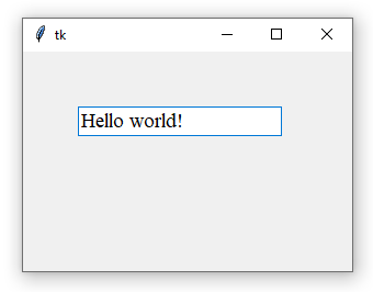
The font argument used when creating the textbox must receive an instance of the tkinter.font.Font class. Tk supports a large number of font families. To see a full list of possible values for the family argument, run the following code in the Python shell:
|
>>> import tkinter as tk
|
|
>>> root = tk.Tk()
|
|
>>> font.families() # Returns a list of available fonts.
|
Other acceptable arguments for font settings are weight, slant, overstrike and underline:
Styles
The rest of the appearance of a textbox can be configured through styles. For an introduction to how styles work, see https://tkdocs.com/tutorial/styles.html.
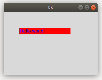
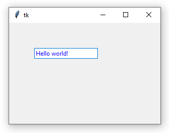
The following code creates a style for a textbox and sets the foreground and fieldbackground properties, which represent the text color and background color, respectively.
Colors are indicated using the RGB notation in hexadecimal or HTML format.
Note that certain operating systems (especially Windows) ignore the fieldbackground property, making it impossible to customize the background color of the textbox using this method. Here's what the same code looks like on Ubuntu and Windows:
The appearance of the selected text can also be configured:
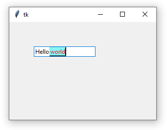
As well as the color and thickness of the cursor (the one that indicates where the focus is within the text):
|
style.configure(
|
|
"MyEntry.TEntry",
|
|
# Cursor color.
|
|
insertcolor="#FF46FF",
|
|
# Width in pixels.
|
|
insertwidth=3
|
|
)
|
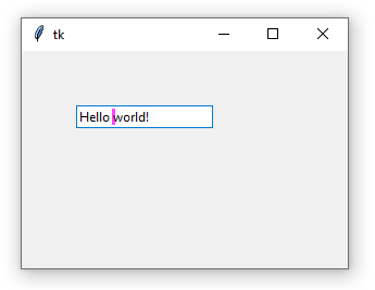
Lastly, you can alter the space (in pixels) between the text and the box margins via the padding argument:
|
style.configure(
|
|
"MyEntry.TEntry",
|
|
# Space between the textbox margins and the text
|
|
# itself (in pixels.)
|
|
padding=10
|
|
)
|
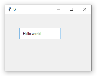
Styles in tk.Entry
New applications should always use the ttk.Entry class. But if you're upgrading old Tk code that still uses the classic tk.Entry widget, since it doesn't support styles, you'll need to configure its appearance by passing arguments when creating the textbox.
For text and background colors, use the foreground and background arguments, respectively:
To configure the cursor and the selected text appearance (color and thickness of the selection), the arguments are the same as those used with styles:
In the classic widget it is also possible to configure the border color and thickness:
|
entry = tk.Entry(
|
|
# Border color when the textbox has focus.
|
|
highlightcolor="#008000",
|
|
# Border color.
|
|
highlightbackground="#ff0000",
|
|
# Border width (in pixels).
|
|
highlightthickness=3,
|
|
)
|
The highlightbackground argument indicates the color of the textbox border when focus is absent, while highlightcolor indicates the color when the widget has focus.