Placing Widgets in Tk (tkinter)
Tk provides three methods to position widgets within a window, which are represented in code by the pack(), place() and grid() functions. They differ in versatility and restrictiveness, so which one you should use it will depend on the result you want to achieve. Let's make an approach to each one of them and see how they work. It is worth noting from the begining that these methods should not be mixed in a single window.
Absolute Position (place)
The place() function allows to position widgets by specifying their absolute position (X and Y) relative to a parent widget. If a widget has no parent, then the parent is the window itself. In almost every graphic library there's an alike way to place elements, since it is the most intuitive one. For example, let's consider the following code.
This little program simply creates a window (main_window), which is the parent widget that will contain any other widget. The window size is 300x200 pixels. Now let's add a button and place it at (60, 40) (i.e., x=60, y=40).
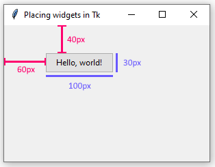
Since the origin of the coordinate system (i.e., the (0, 0) position) is the upper-left corner, this means that between the left border of the window and our button there will be a 60px distance, and between the top border of the window and the button, a 40px distance.
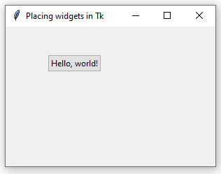
It is possible to indicate the button size (or the size of any other widget) in pixels by using the width and height parameters.
The following image illustrates how these four arguments (x, y, width, and height) influence on the widget position and size.
These four properties might also be formulated as proportional values, relative to the parent widget (which in this case is the window itself). For example, we can tell Tk that the button size must be a half of the window size.
This way, when the window is expanded or contracted, Tk will automatically adjust the button size so it maintains the indicated proportion.
In a similar way work relx and rely, which express the widget position as proportional values.
Thus, after opening the application, when the window size is 300x200, the button will be at (30, 20), because 300x0.1 = 30 and 200x0.1 = 20. Every time the window size changes, Tk will update the button position so it always remains the 10% of the window.
relwidth, relheight, relx and rely support values between 0 and 1.
The place() method to position widgets is pretty simple, specially for users used to other libraries and languages where they have developed desktop applications. It provides exactness in every object within our interface and might be useful in many cases.
The main drawback is when expanding or contracting the window. Although the proportional arguments exposed above might be useful, they are often insufficient. To place widgets by an absolute position implies a static window, which will show empty spaces when the user expands it, or some widgets will remain out of sight when the window is contracted.
Relative Position (pack)
This is the simplest of the three methods. Instead of specifying the coordinates of a widget, we just inform Tk that a widget must be placed above, below, to the left, or to the right of some other widget, or of the main window.
In spite of its simplicity, it is very powerful, and, although not limitless, it might implement complex user interfaces without loosing versatility.
In this example, we create a textbox and a button, and place them in the window via the pack() function. Since we passed no arguments, Tk will by default place the widgets one above the other, as shown in the following image.
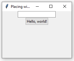
Thus, if we add another widget, like a label, it will be placed below the button.
|
entry = ttk.Entry()
|
|
entry.pack()
|
|
|
|
button = ttk.Button(text="Hello, world!")
|
|
button.pack()
|
|
|
|
label = ttk.Label(text="...from tkinter!")
|
|
label.pack()
|
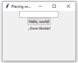
The property that controls the widgets relative position is side, which might be tk.TOP (the default value), tk.BOTTOM, tk.LEFT, or tk.RIGHT. This way, if we indicate that the textbox must be placed to the left, then the other two widgets will remain one above the other.
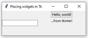
In the same manner, the use of side=tk.RIGHT produces the contrary effect, placing the textbox at the right of the button and the label. You can try yourself several different values for side to understand better how does Tk behave.
The pack() function also admits the after and before parameters, which let us control the order in which the window widgets are situated. The following code forces Tk to put the label before the textbox.
|
entry = ttk.Entry()
|
|
entry.pack()
|
|
|
|
button = ttk.Button(text="Hello, world!")
|
|
button.pack()
|
|
|
|
label = ttk.Label(text="...from tkinter!")
|
|
label.pack(before=entry)
|
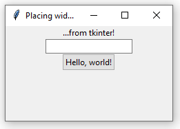
Both before and after accept as a value any widget to take as reference.
Other properties supported by pack() are padx, ipadx, pady, and ipady, which specify (in pixels) a widget's external and internal margins. For example, in the following code there will be a 30px space between the button and the window (external margin), but a 50px space between the button border and its text (internal margin).
|
main_window = tk.Tk()
|
|
main_window.title("Placing widgets in Tk")
|
|
|
|
button = ttk.Button(text="Hello, world!")
|
|
button.pack(padx=30, pady=30, ipadx=50, ipady=50)
|
|
|
|
main_window.mainloop()
|
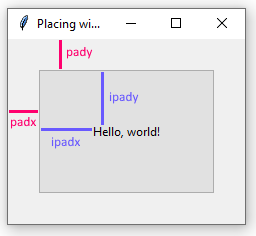
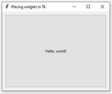
Finally, it is possible to specify which widgets must be expanded or contracted when the window size changes, and in what sense (vertical or horizontal), via the expand and fill properties.
In this example, the button will adjust its horizontal size (fill=tk.X) when the window size changes. If we wanted that it only gets adjusted in vertical sense, then the property would be fill=tk.Y, or fill=tk.BOTH to expand in both senses.
Grid Management (grid)
The grid method is always a great choice, from little applications to big and complex user interfaces. It implies conceptually dividing the main window in rows and columns, forming cells where widgets are located. Let's see an example.
Between lines 7 and 14, we create three widgets (a textbox, a button and a label), and we set their position within the grid via the grid() function.

(Red lines are not part of the UI, of course.) As shown in the image, up to now, our grid has two rows and two columns, which give us a total (2x2=4, right?) of four cells.
The textbox is in the column 0 and the row 0. Following this convention, the button is in the (1, 0) cell, and the label in (0, 1). The (1, 1) cell contains no widget. A grid might have as many columns and rows as we want.
We can tell a widget that it must take more than one row or column. For example, since the (1, 1) cell is empty, our label could take it by using:

columnspan indicates how many columns must be taken by the widget (1 by default). The rowspan behaves in a similar way, but for rows.
By default, columns and rows are not expanded nor contracted if the window size changes. For this purpose, we use the rowconfigure() and columnconfigure() functions with the weight parameter. For example, the following code tells Tk that the column 0 and the row 0 must expand.
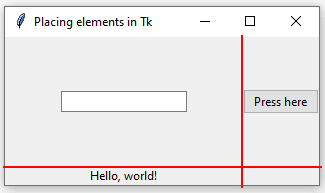
The image shows how the cell has expanded once the window was enlarged, and how our textbox remained at the center of the cell. We can specify if we want our widget to stick to the top, the bottom, the right, or the left of the cell, rather than to stay at the center, via the sticky parameter. The supported values for this parameter are "n" (north), "s" (south), "e" (east), "w" (west).
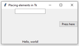
By combining these values, we can tell the widget to expand horizontally ("ew""), vertically ("ns"), or in both ways ("nsew").
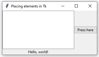
The grid() function accepts, like pack(), the padx, pady, ipadx, ipady arguments to set margins.
Finally, Tk's grid method allows us to configure how much columns and rows are expanded. For example, let's consider the following code.
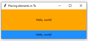
Within this window we create two labels, and put them in the same column (0), but in different rows (0 and 1). Then, via rowconfigure() and columnconfigure() we indicate they must expand and contract when the window (which is the parent widget) does.
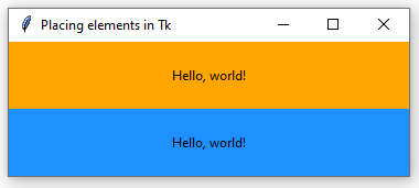
The image shows how the two widgets share the available space, so the one's size always equals the other's, no matter how big or small the window is. But sometimes it is desirable that one widget expands more than the other, or vice-versa. For this, we can increase the weight that a row or column exerts on Tk when expanding.
With this configuration, the row 0 (where the orange label is) size will always be four (5-1) times grater than the row 1 size, as shown in the following image.
Summary
The place() method give us total control over the position of each widget within our window, because we specify the position using absolute coordinates. This is often suitable for small and middle-size user interfaces, where the user doesn't expect to resize the window.
pack() is pretty simple to use and can achieve rich and complex interfaces. Nevertheless, the fact that the position of each widget depends on another widget might cause difficulties when making changes to the interface, specially while modifying existing applications.
Last, the widgets management through a grid, as stated before, is always a good choice. After knowing how it works and applying it carefully, we can reach from little to big user interfaces fully adaptable and easy to use.