Button in Tk (tkinter)
The button is typically the most common widget in a GUI application. A button is a box with a text and/or an image that can be pressed by the user to execute an operation. In Tk it is represented by the tk.Button and ttk.Button (which has a modern style) classes. From the point of view of the code its use is quite simple.
Like any other Tk widget, to get a button we must create an instance of the proper class:
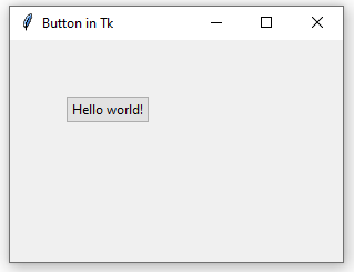
Here we create a window with a button whose text (represented by the text parameter) is Hello world! The result is as follows:

When placing the button via the place() method, if we don't specify, as in this case, its width and height (via the width and height parameters), the dimensions of the button are automatically calculated by Tk to fit the text we have assigned to it. (For the widgets dimensions and positions in general in Tk see Placing Widgets in Tk.)
We said that a button can contain a text and/or an image. For now let's just work with text, we will see how to assign an image later. But a button is not of much use if when pressed by the user it does not execute any operation. To give functionality to a button, we must create a function and then assign it via the command argument. For example, the following code prints a Hello world! message into the console when the user presses the button:
Using the command argument we indicate in the button creation the name of the function that we want to be executed when the user acts on the button (we'll soon see that the button can also be activated through the keyboard). Since we are passing a reference to the function (like a pointer in other languages), the parentheses are not indicated.
It's a bit strange for a desktop application to use print() to display a message. Let's change the code to use a dialog box instead:
It is important to keep in mind that if we execute a more or less "heavy" task (such as downloading a file from the web) within a function called by a button, it is likely that our interface will freeze as long as the task lasts. For a solution to this problem, see Background Tasks with Tk.
The function associated with a button must not require any arguments. However, sometimes it is useful to pass information to this function: for example, when the target function is within another module or Python file, so that it has access to objects in the main module. One possible solution for this is to use the functools.partial() standard function.
In this code, the greet() function, in addition to displaying a dialog box, changes the title of the window, whose reference receives as an argument. In this case, partial() is unnecessary, because root is a global object and therefore accessible from the preceding greet() function. However, keep this pattern in mind when dividing a large application into multiple Python classes or files.
By default, functions associated with buttons are called by Tk when the user clicks on them, but we can also indicate that a button must be activated with the Enter key.
Here the fundamental thing is the bind() method, which is used to associate an event with a function. In this case, the <Return> event (this is how Tk names the Enter key) is linked with the greet_enter() function. Note that this last function simply makes a call to our original greet(). Why not use the same function for both mouse and keyboard events? The problem is that the functions associated via command should not receive any argument, while those associated with <Return> receive an argument (an instance of tk.Event) that contains information about the current event. However, we could simplify the code by using a default value argument in the greet() function:
Now we respond to both events with the same function, but we can know form within greet() whether it has been executed in response to a mouse press (event is None) or to the keyboard (event is not None).
In order for the button to be activated by pressing the Enter key, it must have the keyboard focus. In desktop applications we can switch the keyboard focus between widgets by using the Tab key. If for some reason we want our button to not be able to receive the focus, we can disable the takefocus option:
|
# This button cannot receive the keyboard focus.
|
|
button = ttk.Button(text="Hello world!", command=greet, takefocus=False)
|
A button can be disabled at runtime (so the user is not able to press it) by passing tk.DISABLED to the state property.
|
def greet():
|
|
messagebox.showinfo(message="Hello world!", title="Greeting")
|
|
# Disables the button after displaying the message.
|
|
button["state"] = tk.DISABLED
|
Or you can start up the widget in a disabled state while creating the instance:
To reactivate the button after it has been disabled, use the tk.NORMAL value:
Appearance and Styles
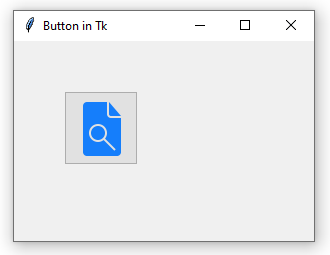
A button might have an image besides the text. You can even have a single image without text. We have already seen that the button text is indicated via the text argument when creating an instance of ttk.Button. Similarly, the image argument is used to set an image, whose value must be an instance of tk.PhotoImage.

While creating an instance of tk.PhotoImage, the image name or path is indicated via the file argument. The recommended format is PNG. Note that it is necessary to keep a reference in memory to the image (img_button) so that Tk can display it correctly in the button. Therefore, the following code fails to display the image:
|
# Error! A reference to the image is not kept in memory.
|
|
button = ttk.Button(image=tk.PhotoImage(file="search.png"))
|
If you want to display a text and an image simultaneously on a button, you need to indicate where the image should appear relative to the text. This is managed by the compound argument.
|
img_button = tk.PhotoImage(file="search.png")
|
|
button = ttk.Button(text="Browse file", image=img_button, compound=tk.TOP)
|
|
button.place(x=50, y=50)
|
tk.TOP means the image should appear above the text. The other possible values are tk.BOTTOM, tk.RIGHT, and tk.LEFT.
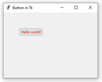
To change other aspects of a button's appearance, you need to create a style. For example, to change the default color of the button's text, we create a style and set the foreground property.
|
s = ttk.Style()
|
|
s.configure(
|
|
"MyButton.TButton",
|
|
foreground="#ff0000",
|
|
)
|
|
button = ttk.Button(text="Hello world!", style="MyButton.TButton")
|
|
button.place(x=50, y=50)
|

The button properties that can be configured through styles are:
foreground, text color;background, background color;padding, space between the the text and the button margins;font, font type and size;anchor, text alignment;image, button image.
(The image property can be defined in a style or passed as an argument on button creation.)
For example:
This code creates a button with red text (foreground="#ff0000"), black background (background="#000000"), 20 pixels between the text and the margins (padding=20), Times New Roman 12 font (font=("Times", 12)), and left-aligned text (anchor="w"). Other possible values for anchor are "e", "s", and "n", which respectively represent right, bottom and top.
However, the background and anchor properties are ignored by many operating systems. On Windows, the text of a button can only be center-aligned. Regarding the background property, which controls the background color, on those operating systems where it is ignored (on Windows it only alters the border color), consider using as a workaround the classic tk.Button widget (instead of ttk.Button):
|
# Black background and red text.
|
|
button = tk.Button(text="Hello world!", foreground="#ff0000",
|
|
background="#000000")
|
|
button.place(x=50, y=50)
|
Classic widgets do not support styles via ttk.Styles, so properties are passed as arguments directly in the creation of the instance.